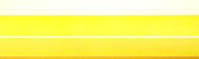
The painting Via Ochre by Kenneth Noland, acrylic on canvas, is composed of horizontal lines that are white, honey yellow, fire yellow, tangerine orange, and light blue. All the lines are different widths. The painting starts with the white and yellow honey lines, then it transitions into the fire yellow and then lastly the tangerine orange.
When I first saw this, I was pulled in, and it may seem odd, since there is not much color or ‘fun’ happening in it. As soon as I saw it, I felt at peace, it brought upon a feeling of safety. Personally, the yellows are soothing, and they remind me of all things happy. Such as, sand, sunshine, lemons, and sunflowers. This is something that I would put in my house because when I look at it, I am content, not happy, but content and no more. When I see art that attracts me, it is typically portraits or people, but it’s the shades that attract me. Not to get sad, but a close relative who passed away recently would wear these shades of colors, and when I was with them, I felt safe. Them being happy, made me link it to happiness. Anyway, this reminds me of the acid colors we learned about class, even though it is on the neutral side of it. It brings me into the late ‘60s with fashion; the yellow is commonly associated with the ‘60s. Your eyes gravitate towards this, and it’s beautiful.
